On the long-anticipated day of judgment, Instructor Brad Vredevoogd furrowed his brow, eyes widening as he examined the chaotic brushstrokes and questionable color choices before him. With an excited smile, he stepped forward, as if searching for any discerning qualities between our similar and amateur art. Finally, he delivered his verdict. “I think for painting with your non-dominant hand you guys did an amazing job and I love this project you took on for yourselves. If I got to choose one I think I would probably lean towards that one,” said Vredevoogd.
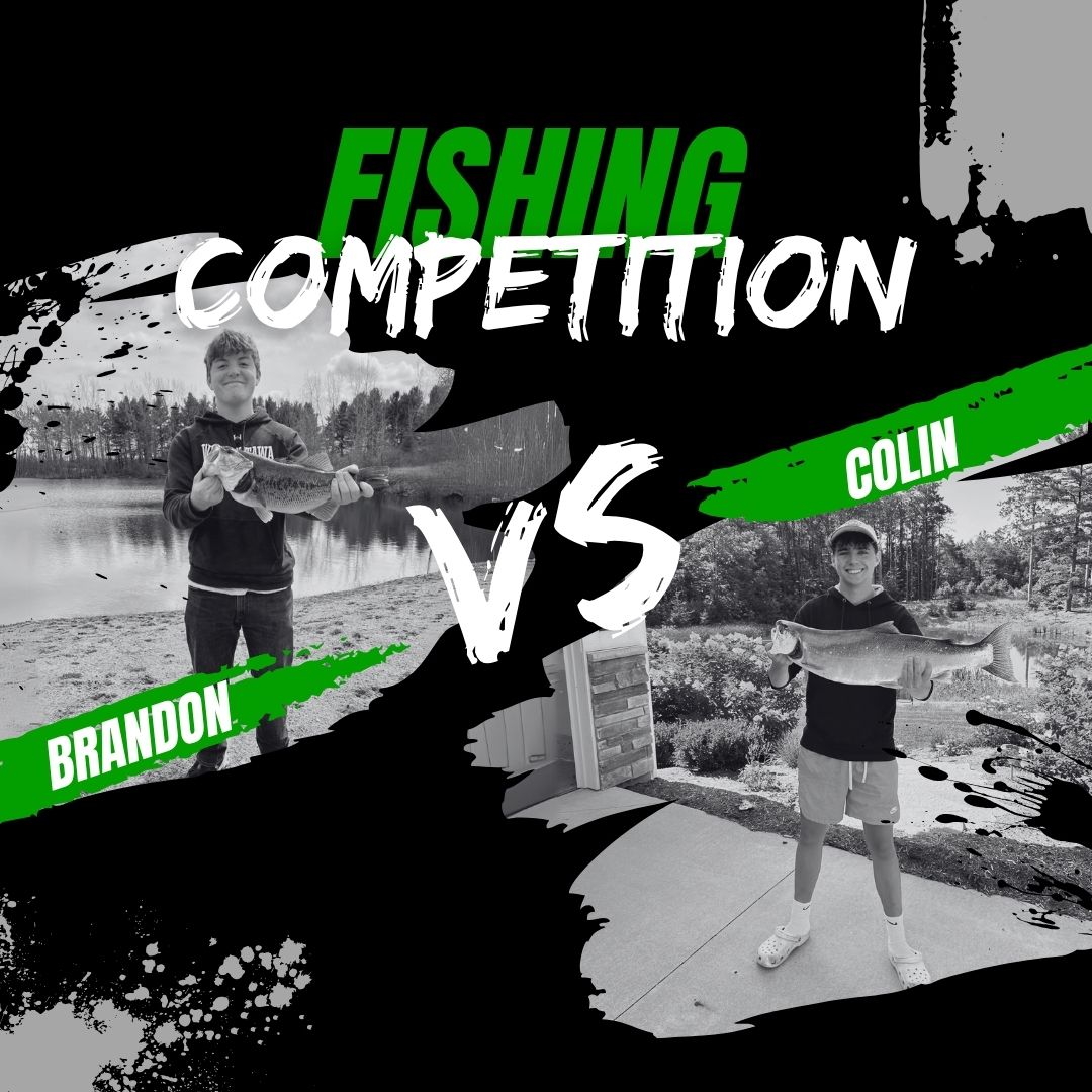
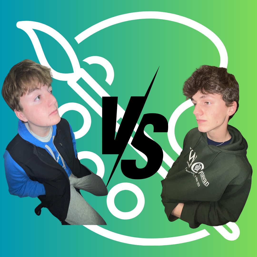
Competition is in our blood. As humans, we have an innate desire to be the best, to rise above challenges, and to push the limits of what we can accomplish. Even when things get tough, we’re driven to test ourselves and often try to do what others might consider impossible. In this article, we attempted something that may seem impossible to some: training our left hands to paint one of Bob Ross’s masterpieces. For one week, we will dedicate ourselves to developing the skill of painting with our non-dominant hands to attempt to recreate Ross’s “Winter Frost” painting.
Each day, we will train our left hands, practicing everything from basic brushstrokes to blending and shading, all in preparation for our big painting challenge. At the end of the week, we will put our skills to the test and attempt to recreate the “Winter Frost” painting. Once our works of art are completed, we will present them to Vredevoogd. He will critique our efforts, offering feedback on the quality of the paintings, and ultimately, he will determine which one he deems to be the best. Will our left-handed masterpieces live up to the challenge? Only time—and Vredevoogd’s judgment—will tell.
Joel’s Process:
The first step on my training journey for my left hand began with a bit of research to determine my strategy. I knew my goal: to defeat Brandon Rockafellow through precision and practice. As I dug deeper, I found that training the non-dominant hand enhances brain function. Studies show it improves the speed and fluidity of elbow joint motion while also increasing activity in the bilateral dorsolateral premotor cortex, the region responsible for motor control. So, with both my personal goal and the broader benefits in mind, I devised a strategy. Exercising different training methods each day for a week.
For my first training method, I took a simple approach. I decided I would commit to doing everyday simple tasks with my left hand. Including tasks such as using a fork to eat meals, brushing my teeth, writing notes in school, and using the touchpad on my Chromebook. Originally, I thought this would be my easiest training idea. It was not easy. Not only was it time-consuming and frustrating, but it was also easy to forget. I cannot count how often I caught myself reverting to old habits and patterns with my right hand. The typical simplicity of the tasks made it extremely irritating to perform them with my non-dominant hand. It forced me to think about what I am doing, instead of it coming naturally.
Another method implemented was my commitment to improving coordination and strength. To improve my overall stability I used a hand strengthener device pictured to the right. Allowing me to change the resistance of the spring and repeatedly squeeze the gadget at different angles to stimulate different muscles within my hand and forearm. I practiced this in the first few days of training in order to allow for proper recovery and the rest of my arm for competition day. For coordination, I took time to make some fun doodles. Although not very impressive, they required a lot of focus. I also focused on engraving the mountain pattern into my muscle memory in anticipation of the competition day.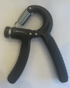
Possibly the most important method in my training was repeated practice. Each day, I dedicated time to writing out the alphabet over and over, ensuring that my movements became smoother and more controlled with each repetition. In addition to letters, I challenged myself by writing up to one hundred numbers, focusing on maintaining consistent size, spacing, and clarity. The primary goal was to develop steady hand coordination and build the endurance necessary. At times, the process felt tedious and even frustrating, but I knew that persistence was key to improvement. Though it was far from enjoyable, the progress I made over time proved that the effort was well worth it.
The strategy I used the least was attempting to play the guitar. Having dabbled in guitar before, I was familiar with the basics, but switching to my non-dominant hand made everything feel foreign. Strumming felt uneven and choppy, so don’t even get me started on fingerpicking. Though I didn’t dedicate much time to this exercise, it still served as a valuable reminder of how much coordination and control my left hand needed to develop.
Lastly, I learned the basics of painting in a Ross style. For this, I followed several YouTube tutorials on how to follow a Ross tutorial. My main takeaways from the videos were the importance of keeping a reference photo at hand, establishing the horizon line early, and not being afraid to apply pressure on the canvas. These simple tips were crucial to my preparation. I also made sure to watch another of Ross’s tutorials to observe his style and strategies. He likes to use quick and simple strokes, which eventually come together to form beauty. 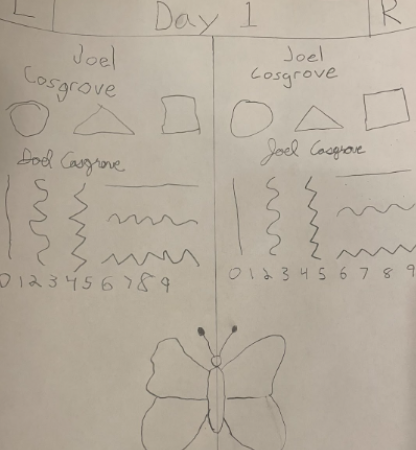
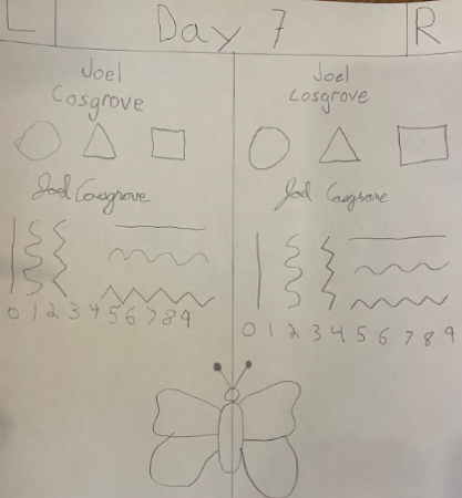
To help visualize my progress, I tested myself on day one and day seven of my training. It is a comparison from my left and to my right. Here are the results:
Although there are minimal significant changes to the pictures, the change came in how I felt. On day seven, I felt much more confident. I finished the picture faster and felt more sturdy and controlled throughout the process. Which made me hopeful and confident going into competition day.
Brandon’s Process:
The competition was going to take a lot of training, but with hard work and determination, I was sure I could beat Joel Cosgrove. My plan was simple: doodle and draw with my left hand all week, and sometimes write my name and notes for class with my left hand. Some research suggested doing exercises to strengthen my left hand and arm, but I decided on a different approach. According to WikiHow, if you want to become good at writing with both hands, you should trace letters and practice writing them over and over. I thought this sounded like a good idea, so I decided to use it as my guide.
On the first day of training, I started by searching for easy doodles to trace with my left hand. The idea was to get my left hand more used to making controlled movements. My first try was awful—I tried tracing a fish doodle, but the lines were messy and uneven. It was frustrating, but I didn’t stop. I kept at it, and by the end of the class, my traced doodles were much cleaner. The fish doodle looked better and more like the original. I was starting to see some progress.
Over the next few days, I decided to challenge myself even more. I looked for harder doodles and started drawing them freehand, without tracing. The first one I tried was a ghost, and it didn’t turn out great—it was kind of lopsided and awkward. But the next day, things got better. I drew a lightbulb and a paradox triangle, and this time, the doodles came out much cleaner and more accurate. It was clear my left hand was getting a bit better at drawing.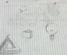
On days two and three, I also practiced writing with my left hand. I started by writing my name, and though it was slow and the letters were kind of shaky, they still looked pretty decent for the first try. It wasn’t easy, but I was making progress. Writing notes with my left hand was even harder, but I was starting to feel like it wasn’t impossible.
By day four, I felt pretty good about how far I’d come. In journalism class, I decided to try something a little different. I used a drawing topic generator to come up with an idea for a new doodle. The generator gave me the suggestion of a snowboarder on a slope. At first, I wasn’t sure how it would turn out, but I decided to go for it. It took me about 5–10 minutes, but when I was done, the snowboarder actually looked pretty good. It wasn’t perfect, but for something I drew with my left hand, it was impressive.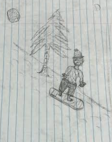
On days five through seven, I didn’t train as intensely; instead, I focused more on preparing for the task ahead. I took the time to formulate a plan that would give me the best chance for success. My strategy for competition day was to watch the video, but instead of strictly following it step by step, I would incorporate some of the techniques from the video along with my ideas. Allowing me to put my personal touch on the piece while also being more efficient with my time. I believed that adding my twist would give me the upper hand in the competition.
By the end of the week, I felt confident in the progress I had made. I was ready for competition day, knowing that I had prepared not just by following the video, but by thinking outside the box and adding my own unique style. With everything in place, I was excited to put my skills to the test and prove that my dedication and strategy would be enough to beat Cosgrove.
Competition Day – Joel’s Point of View:
The training is complete. I have improved. It’s time to shift my focus back to my goal. My mentality would now be to defeat Rockafellow. As I drove to his house with the canvases and paint in my backseat I visualized my soon-to-be perfect brushstrokes and precision. 
As Ross places his orange-gold sun onto his canvas, I reach out to do the same. Before I touch the canvas, I realize the brush is in my right hand. Serving as the one and only wake-up call that I would need. I then came off to a great start, a sun just like Ross’s, and of course, with my left hand.
Early on I was pleased with my coloring of the sky, but struggled to find a way to blend the paint. I tried to overlap them, tried making a blend of the two colors to serve as an in-between, and even tried using a slightly damp paper towel. Nothing looked good. I almost gave up on the blending, until I remembered my training. I was afraid to tamper with the canvas. I then picked the damp paper towel back up and pressed hard into the canvas across the two colors. Oddly enough, it worked. Allowing for a slight mixing of the colors on the canvas itself.
After spending almost an hour on our skies, we decided we were being too perfectionist and needed to transition to the next step. Unfortunately, the mountains were up next. These required another level of precision to make the peaks and straight edges. We decided to use toothpicks to create such a persuasion. With my shaking hand, I put my trust in Ross and created their outline with quick strokes. Once I had finished with the outline, I moved on to the shading. Originally, I was planning on following Ross and using a dark blue to create the shadows on the left side. Rockafellow suggested I pick a different color and told me blue doesn’t work for shading. I trusted that his advice was not sabotage, and created shadows in white on my black mountains. I was quite proud of how these turned out.
Due to the extended time we spent on these two key aspects of the painting, the rest of the time felt like a blur. Again, I trusted Ross and made my trees quick with soft brushstrokes right and left. Ross then immediately paints a line through the middle of his trees. I was confused until it became apparent to me that it was a reflection in a body of water. I loved the concept and tried to recreate it to the best of my ability, repeating the line multiple times, and trying to make the right reflection.
Pleased with my progress, I decided to make a bold choice. I chose a more vibrant color for the pine trees to the left of my painting. After creating them, I decided I would stick with the vibrant theme. I added a striking blue under those trees and at the bottom of the painting, the same as Ross, just a slightly different color. I then added all of the white bush at the bottom and below the trees, over the blue.
Then came my last two challenges, the cabin and the bare trees in the front. The small cabin serves as a testament to my training, as it is such a small yet important piece. It took lots of time and precision to make the correct angles and strokes. It stands out among the white brush and green trees. The trees were the most nerve-wracking part by far. I ended up choosing a simple brown to establish a close foreground for the viewer. After watching Ross complete his perfect trees in about seven seconds, I went back and watched him do it ten more times. For the final touch, I decided to not use quick strokes as I have been. I slowly made two large straight lines across the whole painting. Off of those I added the branches, which slightly imitate the ones of Ross.
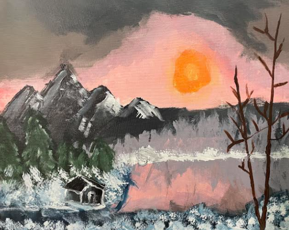
Overall, my painting is an adaptation of Ross’s “Winter Frost” with eye-catching colors and striking focal points. It pictures a beautiful sunrise over a family’s vacation cabin. As they peer out their window, they see massive mountains and a beautiful pond, reflecting the many trees and the colors of the sunrise. But more importantly, it’s better than Rockafellow’s.
Competition Day – Brandon’s Point of View:
It’s competition day, and I’m feeling pumped. My first thought is, “I’ve got this in the bag.” The first thing Ross instructed us to do was paint the sky. I quickly mixed a soft peachy pink and spread it across the canvas, covering the entire width. Next, I mixed a deep purple and painted it on the canvas, followed by a brownish purple to tie the colors together.
We were then told to blend the colors, which is when the painting started to get tricky. The oil paints Ross uses are expensive, so we had to use acrylics instead. The problem with acrylics is that they don’t blend as easily as oils, so I had to create a variety of colors to help them fade smoothly into one another. My goal was to make sure the colors didn’t appear as separate blocks but blended seamlessly across the canvas.
Next, we moved on to the mountains. Ross painted his mountains not only in record time but also with a painting knife, which added another challenge. To replicate his technique, we had to use toothpicks. Initially, I painted three mountains in dark black and gray, but as I watched the video more closely, I realized the mountains needed to be lighter to show the snow. Not only that, but one of the mountains was too wide, throwing off the balance of the painting. So, I decided to add a smaller mountain to balance things out. Although I had to redo the mountains, I was happy with how they turned out in the end.
Then came the third major step: the trees. At this point, things started to go downhill for me. Ross painted the trees in the background, but my left hand started to get in the way. I made the trees way too big. I thought the larger trees should be in the foreground, but I ended up making them too large on both sides of the canvas, which would create problems later.
To differentiate the trees in the background from the foreground, I tried adding white highlights to make them look lighter as if they were closer to the viewer. But instead of creating a subtle effect, the trees turned completely white. I spent about 30-45 minutes fixing my mistake, and after some time, I was able to paint five trees which looked much better.
Next, I tackled the chaotic purple brushstrokes in the background, which were meant to represent more trees. I used black paint to create streaks for the tree trunks and branches, helping to distinguish the individual trees. While they weren’t perfect, they now looked more like trees rather than random brushstrokes.
Then came the biggest challenge of all. After hours of painting, I realized I’d completely forgotten about the pond. I had been so focused on perfecting the trees that I didn’t leave room for the pond. So, instead of painting a pond, I created a snowy bank by painting white in the open space. The problem was, I didn’t have a small enough brush to get the white paint between every tree, so I had to leave the sky reflection. I decided to make the entire scene look like it was set on a snowbank by a pond. If you look closely, the different shades of color between the trees resemble the reflection of the sky on water.
As I was working, I suddenly remembered that there was a small cabin in the scene. I decided to make the cabin the focal point to fill the empty space. I started with a cube shape for the cabin and added a roof on top, following the same angle as the cube. To make the cabin blend in better with the scene, I painted the roof white to look like snow and highlighted parts of the cabin to help it fit into the overall composition.
After all the hard work, I added my final touches to enhance the painting. That’s when Cosgrove suggested adding brushstrokes at the bottom of the canvas. I started with white splotches, followed by light brown, and then darker brown to create the effect of brushstrokes.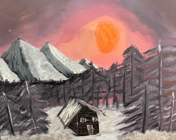
In the end, I like to think of my painting as a view through an opening in the trees, with a cozy snowy cabin sitting on a snowbank, surrounded by tall trees. I imagine it’s somewhere full of natural beauty, like the mountains of Alaska. I can picture myself walking through the woods, watching the sunset. Overall, I feel that my painting is a blend of my creativity and Ross’s influence, and I’m proud of how it turned out.
Judgement Day:
We are both honored by the opportunity to share our paintings with Vredevoogd. He was incredibly kind to take the time to work with us. That being said, we anonymously presented our paintings to him. For clarity, (A) will mean a reference to Cosgrove’s painting, and (B) will mean a reference to Rockafellow’s painting. Here are his critiques of the paintings.
“Not bad, it’s pretty impressive. I don’t know who did which one, which is a good thing. For color choices, you guys made some similar choices you know looking at the original painting. These trees look almost like a fire came through. There’s not a lot of color in those (B). I like that this one has a little more color variation in the mountains and the trees and especially this tree in the foreground which kind of pops out a little bit more (A). These look very kind of similar, so this one (A) has a little more color variation than this one (B) even though the sky is really similar. This one (B) is interesting too because the artist chose to make a larger shack where this one (A) is more proportional to the Bob Ross original painting. Now what’s cool about the darker mountains (A) is whether you know this or not, having a dark color in the background will push the lighter colors like the green and the trees and the snow forward, making it more eye-catching. So to me, there is a little more contrast in this one than this one (A) which makes it as if I am comparing them a little bit more eye-catching. They are both good though. I think for painting with your non-dominant hand you guys did an amazing job and I love this project you took on for yourselves. There’s a little bit more going on here too in the snow with the blues and the whites (A) as opposed to the grays and the whites (B). They make that one (A) a little bit more interesting color-wise. This one (B) is very similar and is more monochromatic, where you have more colors going on in this one (A) to develop more contrast. Now that said, I do like these mountains too (B) this artist to a good job overall, you both did. I say nice work. Just in terms of contrast that one (A) is a little bit stronger but they are both pretty darn good. If I got to choose one I think I would probably lean towards that one (A) because of the darker mountains pushing things forward more.”
Cosgrove has reigned victorious in this challenge.