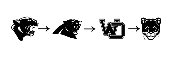
In 2022 near the end of the school year, West Ottawa decided to take down the old panther banner and put up a new one with a brand new logo. The logo changed from a block WO to a panther head from a straight-on view.
The main panther logo has changed three times since the first logo in 1961. These four logos are not the only ones, though; there are many other panther logos in West Ottawa history. They are specific to certain teams or just an alternate.
Of the four main logos, the new one is looked at as the “weaker” logo and in the survey of forty-one athletes, only 5% of West Ottawa athletes rated the logo a ten out of ten while 22% of them rated it a one. The reason that the logo looks “weaker” is because it is a younger panther compared to a full-grown panther. The logo also looks too cartoonish and more like a cat than a panther. Even though the logo is not favored by athletes it seems like the logo will be around for a while because West Ottawa trademarked the logo meaning no one else can use it, so hopefully in the future, it will grow on West Ottawa students and athletes.
The logo before the current one was a block WO. Many people liked the logo even though it wasn’t a panther. The logo has been around since the original Panther in 1961 but wasn’t the main logo until 2012. About 22% of athletes rated the logo a ten out of ten and only 5% rated it a one. The block WO is the second most liked of the four main logos. The logo is still used in conjunction with the current logo but it is not the main one anymore.
Before the block WO was the most liked logo of the four. The logo took inspiration from the NFL team of the Carolina Panthers and would most likely still be the logo if the NFL team hadn’t served a cease and desist from the Panthers because the logo was too similar. The logo was “mean,” it was yelling, had sharp teeth, and was a full-grown panther, just like Carolina’s logo except black and white. The logo lasted from 2000 to 2012 before receiving the cease and desist letter. About 24% of athletes rated it a ten and 5% rated it a one. Many Panther athletes like the logo a lot.
The original panther logo was a side view of a fairly realistic panther and compared to the two that came after, the logo looks “weak.” It has sharp teeth and is yelling but the eyes look almost sad, and the whiskers in the front throw it off as well. About 7% of West Ottawa athletes rated the logo a ten and 12% rated it a one. Many people rate the logo higher because it is the original and has been around for so long. The logo was around from 1961 to 2000 lasting almost forty years. Athletes think it is better than the current Panther logo, but not by much.
There are also many alternate and team-specific logos. Pretty much all the teams have specific logos. All the alternate logos are very similar to the main four with a few exceptions with soccer and rugby.
The soccer team has had many logos, but they are very similar with slightly different styles. All the logos have a shield, a panther, and a soccer ball. The newest soccer logo uses the new logo and the block WO and it looks really good. The previous soccer logo is split into four sections. It had the original Panther logo and a soccer ball in two of the sections. The other two sections were a “W” and an “O”. The logo is okay but could be improved. The other logo is the women’s soccer logo with a triangular shield and a panther crawling out of the middle. The only problem with the logo is that again the panther looks young and not as “mean’ or “tough.”
The rugby logo is unique from the rest of the logos. There is a panther on top of a block WO, and the panther looks very “mean” but a problem with the one is that the logo looks “messy” and does not fit with the other logos.
Many of the team logos are the block WO with a little something added to it. The lacrosse team logo is just the block WO with two lacrosse sticks behind it. The football team logo is the block WO on a football helmet. Then most of the other team logos are the block WO with the sport spelled out below it.
The West Ottawa logo has gone through many changes and had many logos, but what always stays the same with students and athletes at West Ottawa is that they like a “tough” and “mean” panther over a younger “soft” and “weak” panther. Athletes also don’t mind the block letters which is an iconic logo style. The main idea of a logo is to represent an organization, and athletes like to be represented as tough and aggressive.


